AI Math Solver
Resources
Questions
Pricing
Login
Register
Home
>
Questions
>
How to Calculate Mean Ratings from a Bar Chart and Make a Company Recommendation
Mathematics
Grade 8 (Junior High School)
Question Content
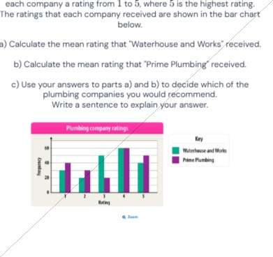
Each company a rating from 1 to 5, where 5 is the highest rating. The ratings that each company received are shown in the bar chart below. a) Calculate the mean rating that 'Waterhouse and Works' received. b) Calculate the mean rating that 'Prime Plumbing' received. c) Use your answers to parts a) and b) to decide which of the plumbing companies you would recommend. Write a sentence to explain your answer.
Correct Answer
a) 3.2; b) 3.4; c) I would recommend Prime Plumbing, because it has a higher mean rating, indicating it received better overall customer feedback.
Detailed Solution Steps
1
Step 1: Extract the frequency of each rating for Waterhouse and Works from the bar chart: Rating 1: 30, Rating 2: 20, Rating 3: 50, Rating 4: 40, Rating 5: 60
2
Step 2: Calculate the total rating points for Waterhouse and Works: (1×30) + (2×20) + (3×50) + (4×40) + (5×60) = 30 + 40 + 150 + 160 + 300 = 680. Calculate total number of ratings: 30+20+50+40+60=200. Mean = 680÷200 = 3.2
3
Step 3: Extract the frequency of each rating for Prime Plumbing from the bar chart: Rating 1: 20, Rating 2: 30, Rating 3: 10, Rating 4: 60, Rating 5: 80
4
Step 4: Calculate the total rating points for Prime Plumbing: (1×20) + (2×30) + (3×10) + (4×60) + (5×80) = 20 + 60 + 30 + 240 + 400 = 750. Calculate total number of ratings: 20+30+10+60+80=200. Mean = 750÷200 = 3.4
5
Step 5: Compare the two mean ratings: 3.4 > 3.2. Since a higher mean rating reflects better overall customer satisfaction, recommend Prime Plumbing and explain this reasoning in one sentence.
Knowledge Points Involved
1
Mean Calculation for Grouped Data
The mean for grouped data is calculated by multiplying each data value by its frequency, summing these products to get the total of all data points, then dividing by the total number of data points. It is used to find the average value of a dataset where values are repeated with specific frequencies, common in analyzing survey results or rating data.
2
Bar Chart Interpretation
A bar chart uses rectangular bars to represent categorical data, with the height or length of each bar corresponding to the frequency of the category. It is used to visually compare frequencies of different groups, making it easy to extract quantitative data for further statistical calculations.
3
Statistical Comparison for Decision-Making
Mean values can be used to compare the overall performance or feedback of different groups. A higher mean in rating data indicates better overall satisfaction, so it can be used to make evidence-based recommendations between options.
Loading solution...